Living Room Designs for Small Spaces – 12 Layouts That Make Square Footage Disappear
A small living room tends to make every decision feel important. One wrong sofa, one cluttered console, or one rug that’s too small can make the whole room seem cramped instead of cozy.
For most people, playing it safe seems to be the only solution, but it often creates a space that feels timid and tight.
The rooms that actually work aren’t necessarily smaller; they’re smarter. The best small living rooms don’t have the least amount of stuff; they feature pieces that serve at least two functions. Every sightline is carefully considered, and the scale is used intentionally rather than hesitantly.
Get this right, and the result isn’t just a nicer room; it’s a living room that feels complete, instead of a space where you wait to “fix” things once you have more room.
Below are 15 real layouts that show a small footprint isn’t the problem; indecision is. Each one explains why it works, so you can apply the same ideas even if your room looks different from the photos.
12 Living Room Designs for Small Spaces
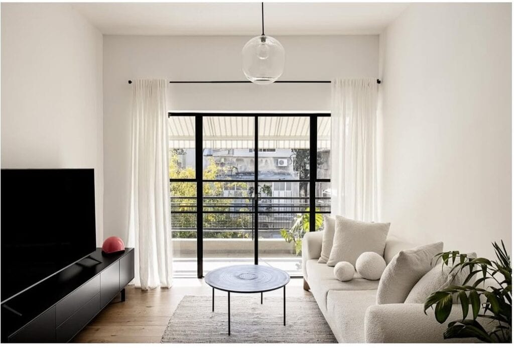
The Ottoman-as-Coffee-Table Swap
This small living room skips a traditional coffee table in favor of an upholstered storage ottoman. It pairs this with a slim nesting side table beside the sofa, creating some usable surface area. This is a smart choice in a small space.
A hard coffee table can feel like another obstacle to deal with, while a soft ottoman can serve as extra seating, a footrest, or a place for a tray, all without adding more “furniture” visually.
The matching off-white fabric on the ottoman and sofa keeps the seating area looking like a cohesive piece rather than separate items vying for attention.
Takeaway: If your living room feels cramped, consider your coffee table first. A soft ottoman in a fabric that matches or complements your sofa can serve the same purpose while taking up less visual space.
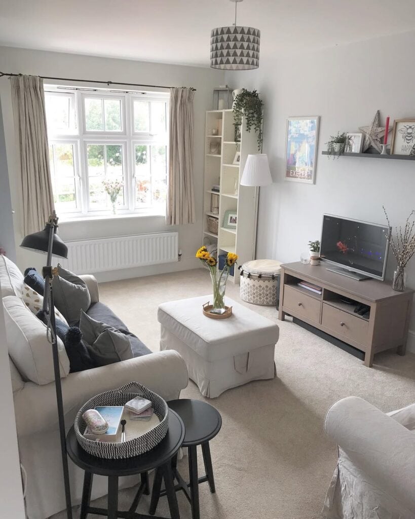
Why This Works: Vertical storage. The bookshelf beside the window is tall and narrow instead of wide and low. It reaches up the wall without taking up much floor space. A trailing plant on top draws the eye upward, making the ceiling feel higher and the room feel more spacious instead of smaller.
Built-In Seating That Wraps the Corner
The sectional here is the entire strategy. Instead of having a sofa, an armchair, and a loveseat competing for floor space, a single continuous corner unit meets the seating needs in a single footprint. By pushing it into the corner and wrapping it around two walls, the center of the room stays genuinely open rather than being divided by gaps between separate pieces.
The low-profile arms and back keep the shape from feeling bulky, even with its size.
Takeaway: Before buying a sofa and a chair separately, consider whether a single corner sectional would actually give you more usable floor space while providing the same or more seating.
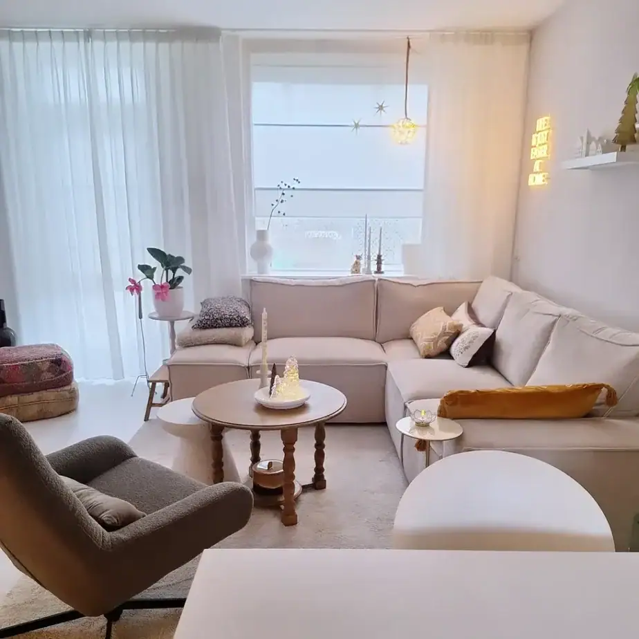
Designer Tip: Layer your lighting at different heights and intensities. Here, a small LED accent piece on the coffee table, a wall-mounted neon sign, and sheer curtains that diffuse daylight all work together rather than relying on a single overhead fixture. Small rooms feel cozy, not cramped, when light comes from several soft sources instead of one harsh one.
The Single Statement Window as Focal Point
There’s almost no decor here to compete for attention. The small living room’s main feature is the floor-to-ceiling black-framed window, which is left completely open, with no furniture or curtains blocking it.
The sofa and TV console sit flat against their walls, allowing the entire window wall to feel spacious.
This approach uses restraint as a design tool. In a small space, one strong focal point will always be more effective than several competing for attention.
Takeaway: Identify your room’s best architectural feature, such as a window, a fireplace, or a high ceiling, and ensure furniture placement does not block or compete with it.
Best For: Renters or minimalists who want a small room to feel calm rather than curated. This look relies on keeping very little on display, so it works best for people who are truly comfortable cutting down to the essentials, rather than for collectors who want everything visible.
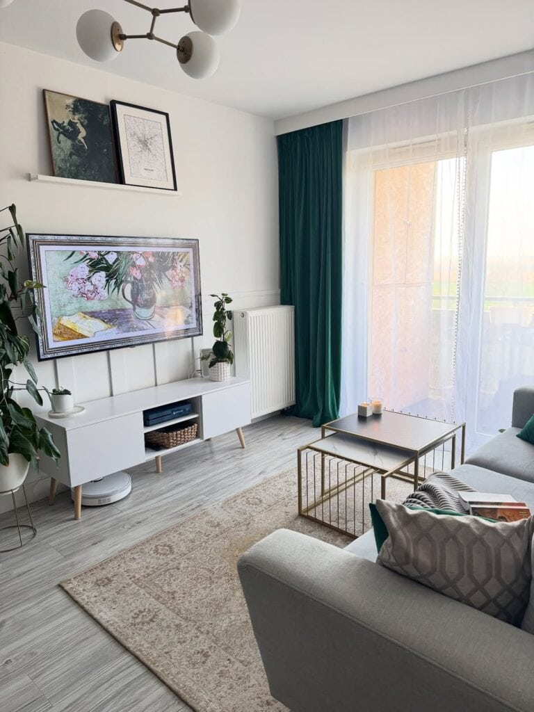
Anchoring the Room with One Bold Color
Against a neutral backdrop of white, grey, and pale wood, a single emerald velvet curtain panel shines. It goes well with brass-framed nesting tables and a botanical-themed digital frame, but the curtain grabs the most attention. One bold color choice feels more intentional than several muted ones.
Notice the nesting coffee tables: two small tables are stacked at different heights, offering flexibility without overcrowding the seating area.
Takeaway: If you’re wary of using color in a small room, go for one bold piece, like a single curtain panel or an accent chair, instead of adding small touches of color across many items.
Common Mistake to Avoid: Hanging curtains just at the width of the window frame. Here, the curtain track stretches nearly wall-to-wall and from ceiling to floor. This creates an illusion that makes the window and the room appear taller and wider. Installing curtains too close to the window frame is one of the quickest ways to make a small room feel even smaller.
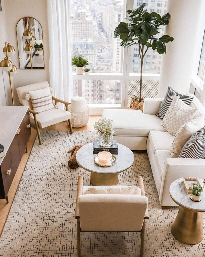
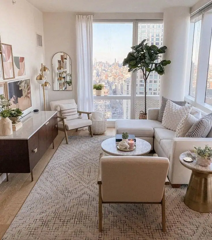
Mixed Seating at Varied Heights
Instead of a matching sofa and loveseat set, this layout features a low sectional, an armchair with wooden legs, and a backless slipper chair. These three different seat heights and shapes are anchored by a single rug. This variation keeps the eye moving and prevents the seating area from looking like one heavy block of upholstery.
A round marble-and-brass coffee table and a slim side table complement each other in material without being identical, tying the mixed pieces together.
Takeaway: You don’t need matching furniture to create a cohesive small living room; instead, repeat one material or finish, like brass and marble, across pieces of different shapes.
Styling Suggestion: Notice how the fiddle-leaf fig in the corner frames the window view instead of blocking it. Its height draws the eye up toward the high ceiling, a useful trick in apartments where ceiling height is the main advantage.
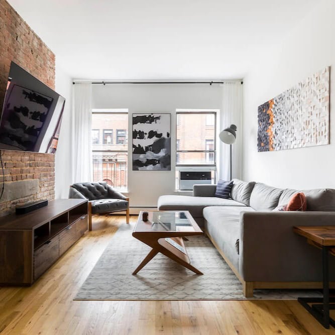
Exposed Brick as Free Texture
Instead of trying to cover the existing brick wall with paint or paneling, this small living room keeps it raw and uses it as a built-in feature wall. The TV is mounted directly onto the brick, and everything else, like the sofa, art, and lighting, stays neutral so the brick can stand out. A low, angular wood coffee table with slim legs keeps the floor visible beneath it. This is more important in a narrow room than the table’s surface area.
Takeaway: If your small space has an architectural feature that you might usually cover, like exposed brick, a structural beam, or an old fireplace, consider leaving it exposed. Build the rest of the room’s colors around it instead of trying to hide it.
Pro Tip: Opt for furniture with legs rather than skirted bases when you have limited floor space. In this room, every piece of the sofa, the chair, the coffee table, and even the side table sits on visible legs. This allows the eye to travel underneath and keeps the floor from blending into a solid mass of upholstery.
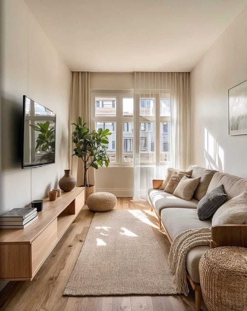
The Long Low Console Instead of a Boxy TV Unit
This narrow living room addresses its width issue by installing a long, low floating-style console along the entire wall instead of a tall, bulky media unit. Because it is low and visually light, sitting on thin legs with open shelving rather than solid doors, it does not compete with the ceiling height like a larger unit would. The fiddle-leaf fig at the far end is intentionally placed to soften the console’s harsh line and break up the room’s length.
Takeaway: In a narrow or boxy room, replace a tall storage unit with a long, low one. Horizontal lines visually extend a room, while vertical bulk makes it feel smaller.
Budget-Friendly Alternative: You don’t need a custom-built console to achieve this look. A simple IKEA-style floating shelf unit or a basic low sideboard on tapered legs can create the same horizontal, airy effect at a much lower cost than built-ins.
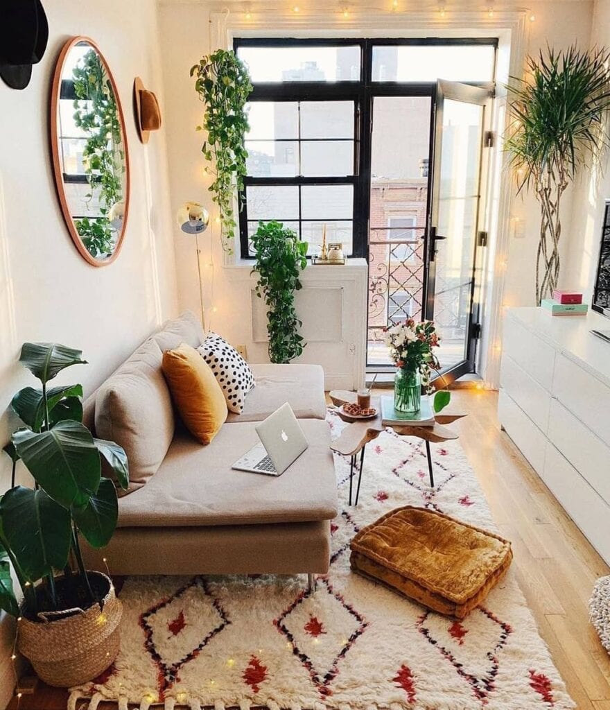
Maximalist Layering in a Tiny Footprint
This shows that “small living room” doesn’t have to mean “minimal.” String lights, trailing plants, a patterned shag rug, and mismatched accent pillows can all exist in a tiny room without feeling chaotic.
The trick here is repetition. Using warm wood tones, greenery, and a steady palette of neutral colors with pops of color helps the space feel layered instead of cluttered. The round mirror on the wall also plays an important role. It visually doubles the depth of the corner it reflects.
Takeaway: If you love a maximalist look but worry it will overwhelm a small room, anchor it with one repeating color story (in this case, warm neutrals and green) so the variety feels intentional.
Common Mistake to Avoid: Skipping the mirror. In a room this size, a single well-placed mirror, angled to catch a window or doorway, can visually expand the space more than almost any other single item.
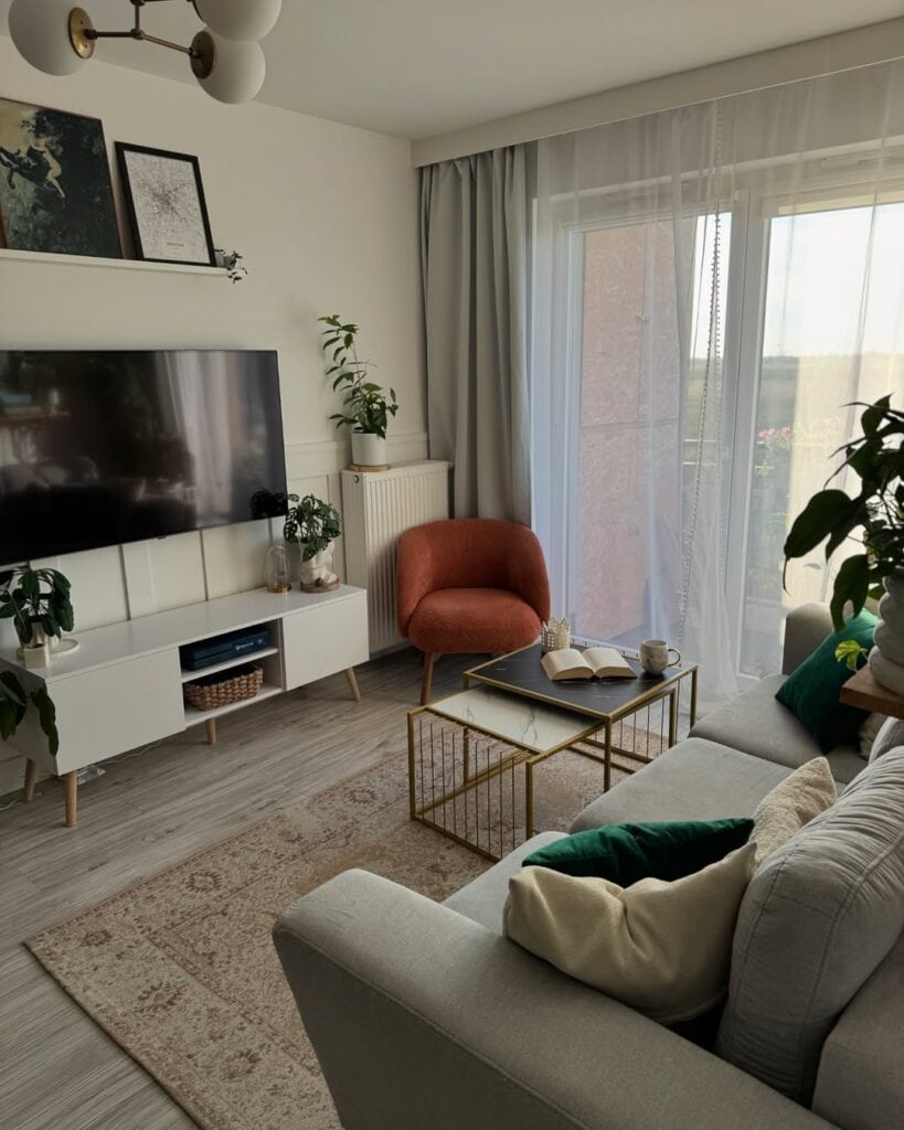
The Accent Chair as a Color Anchor
A single burnt-orange boucle chair stands out as the room’s main focus against the grey-and-white background. You don’t always need a bold color on a large piece, like a sofa, to make an impression. Its placement in the corner, near the window, allows it to be admired without obstructing the main seating area.
The nested gold-framed coffee tables follow the same idea from earlier: two smaller tables instead of one large one create flexible surface space without adding visual weight.
Takeaway: If you’re unsure about buying a bold sofa, start with something smaller. One striking accent chair lets you test a color or texture at a lower cost and with less risk.
Styling Suggestion: Choose lower-backed or open-armed chairs near windows so they don’t block light from reaching the room. This chair’s rounded, open shape allows daylight to flow through instead of casting a dark silhouette at the window.
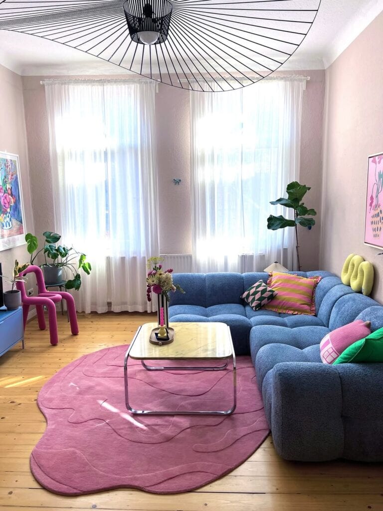
Color-Blocking with Furniture, Not Paint
This small living room gets its personality from the furniture color rather than the wall color. A soft pink wall remains subtle while a cobalt blue boucle sectional, a hot pink chair, and a curved pink rug take center stage. It works because the color scheme is controlled. Pink, blue, and green appear across the sofa, rug, chair, and pillows. So even though the room is bold, it doesn’t feel random. The organic, puddle-shaped rug also softens the room’s straight lines, which helps a small space feel less rigid and boxy.
Takeaway: If you love color but rent or aren’t ready to commit to paint, focus on bold choices in furniture and textiles instead. They are easier to change later and can have just as much visual impact as wall color.
Why This Works: Keeping the color scheme to three colors, blue, pink, and green, across various pieces prevents a chaotic feel. A small room can definitely handle bold colors, but it can’t handle an unlimited palette. Too many colors competing will make the space feel busy rather than playful.
Two Accent Chairs Instead of a Sofa-and-Loveseat Pairing
This small living room complements its sectional with two accent chairs rather than another bulky sofa. Each chair has slender tapered legs, making them appear light rather than overwhelming.
A round marble coffee table and a slim brass-based side table match in finish. A tall fiddle-leaf fig and an arched mirror both help draw the eye upward and outward, maximizing the impact of the wall of windows behind them.
The dark wood case furniture, specifically the credenza, sits low to the floor so it doesn’t compete with the lighter seating around it.
Takeaway: If one sofa doesn’t provide enough seating for your space, choose two lightweight accent chairs instead of a second heavy upholstered piece. They meet the same need without adding visual bulk.
Why This Works: Every major sightline in this room leads to the window. The credenza, mirror, and plant are all arranged to reflect the view or to reach toward it, helping a narrow room feel as if it extends beyond its actual walls.
Splitting One Room Into Two Distinct Zones
Instead of treating this space as one large living room, the layout divides it into a lounge area with two facing sofas and a dining area with a round table and chairs by the window. The boundary is marked only by open floor space and a change in flooring color. Positioning a sofa away from the wall, rather than pushing everything against the perimeter, is a common approach for larger rooms. However, it works here because the room is deep enough to allow a walkway down the middle.
Takeaway: If your small living room needs to serve two functions, such as lounging and dining or working and relaxing, define each space with furniture and a rug rather than walls. This will make the floor plan look organized rather than cluttered.
Best For: Studio or open-plan apartments where the “living room” functions as two or three rooms at once. Using furniture arrangement to create zones helps this combination feel like a cohesive floor plan instead of a hallway lined with furniture.
Conclusion
A small living room doesn’t need fewer decisions; it needs more confident ones. Indecision makes a small room feel cluttered, not the square footage.
If you find yourself looking at your room, unsure of where to start, choose the single biggest issue right now. Is it the lack of seating, a missing focal point, an awkward TV wall, or a room with no personality? Fix that one problem with the most confident option you can afford, rather than the safest choice. Once that key decision is made, the rest of the room tends to fall into place around it.
When you start seeing constraints as the guiding force for good decisions instead of an excuse for hesitance, a small living room stops feeling like something to apologize for. Instead, it begins to feel like the most intentional room in the house.