15 Small Kitchen Decor Ideas That Make a Tiny Space Feel Twice as Big
A small kitchen often feels cramped, with cluttered counters, dark corners, and a layout that never seems complete. The good news is that size isn’t the issue. Usually, it’s the decor that needs attention.
Choosing the right colors, adding layers of lighting, and paying attention to styling can make a small kitchen feel open, purposeful, and even a bit luxurious, all without any renovations.
In this roundup, you’ll find really small kitchens that have achieved this balance. Each kitchen decor idea is broken down so you can see what makes it successful and apply these techniques to your own space. Let’s dive in.
Small Kitchen Decor Ideas
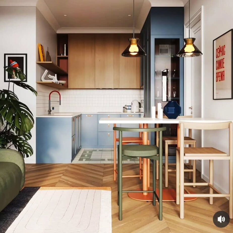
Color-Block Cabinetry to Define Zones
This compact kitchen features dusty blue lower cabinets paired with warm wood upper cabinets. A deeper navy accent column marks the transition into the dining nook. By dividing the colors by zone instead of painting everything one color, this kitchen design gives a small space visual structure without adding extra square footage. The warm wood tone prevents the blue from feeling cold, while brass hardware connects the two sections.
Takeaway: If your small kitchen flows into another room, use a color or material change, not a wall, to show where one area ends and the next begins.
Designer Tip: Limit yourself to two complementary colors in a small space. Using three or more colors can visually shrink the area instead of making it feel larger.
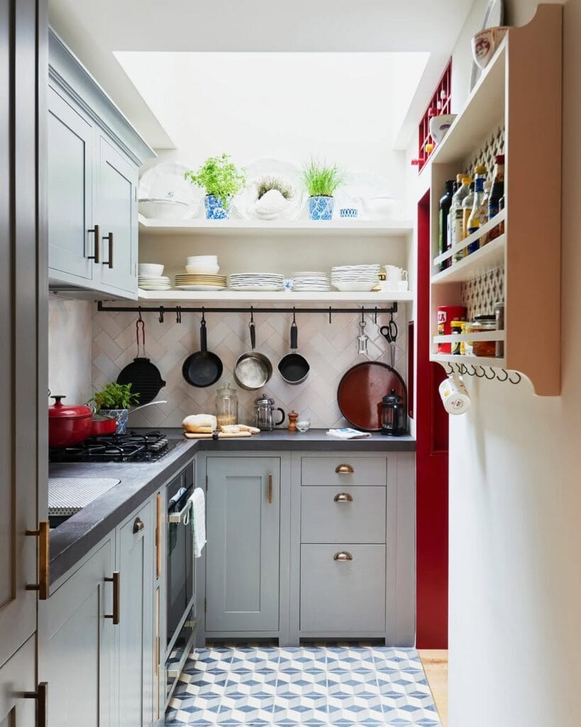
The Hanging Rail as Both Storage and Decor
A black rail mounted under open shelving holds pots, pans, and utensils for easy access. A herringbone tile backsplash adds texture behind them. This design works because it moves everyday cookware off the counter and onto the wall, freeing up valuable counter space while turning necessary items into a styled display.
The mix of metals, including brass hardware, a black rail, and copper-toned pans, prevents the look from being too plain.
Takeaway: Look at what currently clutters your counters, such as pots, cutting boards, and mugs. Consider whether these items could be mounted on a rail or placed on a shelf instead, creating more usable workspace.
Best For: Galley or one-wall kitchens where counter space is the main issue.
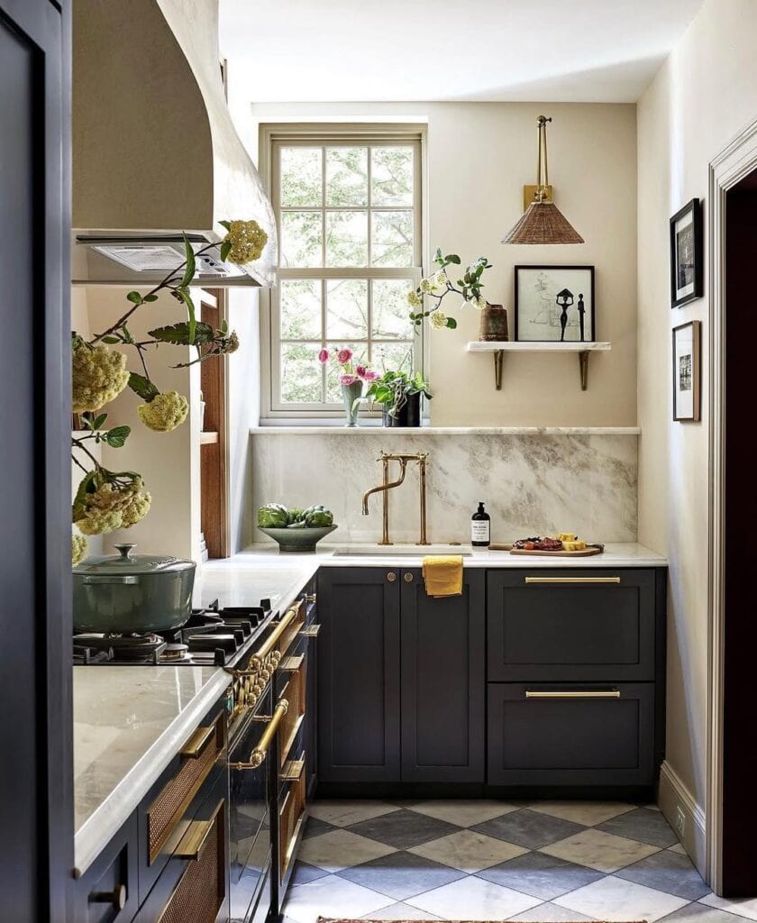
Dark Cabinetry Paired with Light, Reflective Surfaces
Charcoal-black cabinets paired with a marble backsplash and countertop, and natural light from a large window. This decor setup shows that dark cabinetry doesn’t have to make a small kitchen feel cramped.
The main technique here is contrast: light reflects off the marble and brass fixtures, preventing the room from feeling enclosed even though the cabinets are deeply saturated. Brass hardware and a single statement light fixture bring warmth without distracting from the overall design.
Takeaway: If you like dark cabinets but worry about making a small space feel even smaller, combine them with a light, reflective countertop or backsplash to keep the room looking open.
Why This Works: Dark tones recede while light tones reflect light forward. Using both together adds depth instead of flatness.
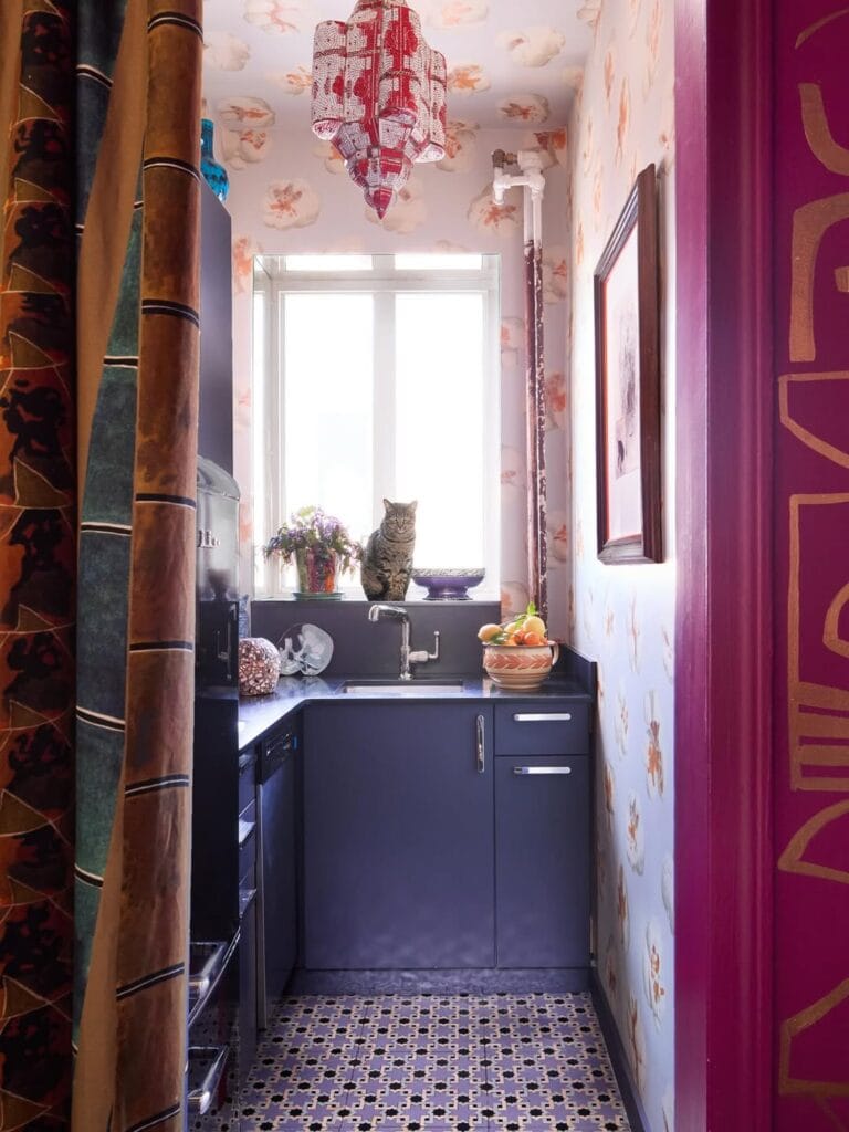
Pattern-on-Pattern as a Deliberate Style Statement
Floral wallpaper, a patterned tile floor, and a detailed beaded pendant light all fit together in this tiny galley kitchen. This shows that “more is more” can work in a small space when a consistent color palette brings everything together. The key here is using restraint while embracing abundance. Every pattern features the same warm, muted color family (blush, rust, plum), so the space feels curated rather than chaotic. This approach is high-risk and high-reward, making it ideal for someone with a strong personal style.
Takeaway: If you want to mix patterns in a small kitchen, choose a tight color family so it feels intentional rather than overwhelming.
Common Mistake to Avoid: Mixing patterns with clashing color palettes, which makes the design look chaotic rather than curated.
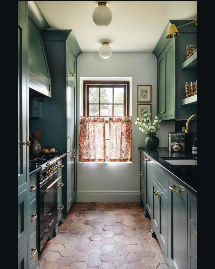
Monochromatic Cabinetry to Make a Galley Feel Cohesive
This narrow galley kitchen features the same deep green for all cabinet surfaces, including the upper, lower, and pantry units. It includes brass hardware and a warm terracotta hexagon floor. Painting the cabinets the same color in a tight space removes visual breaks. This helps the galley feel more open and less cramped. The terracotta floor and brass fixtures add warmth, ensuring the monochrome color scheme remains inviting.
Takeaway: In a narrow or galley kitchen, using the same color for all cabinets creates a longer, more continuous sightline.
Pro Tip: Combine a deep, rich cabinet color with a warm-toned floor, such as terracotta, wood, or warm stone, to keep the space from feeling dark or cold.
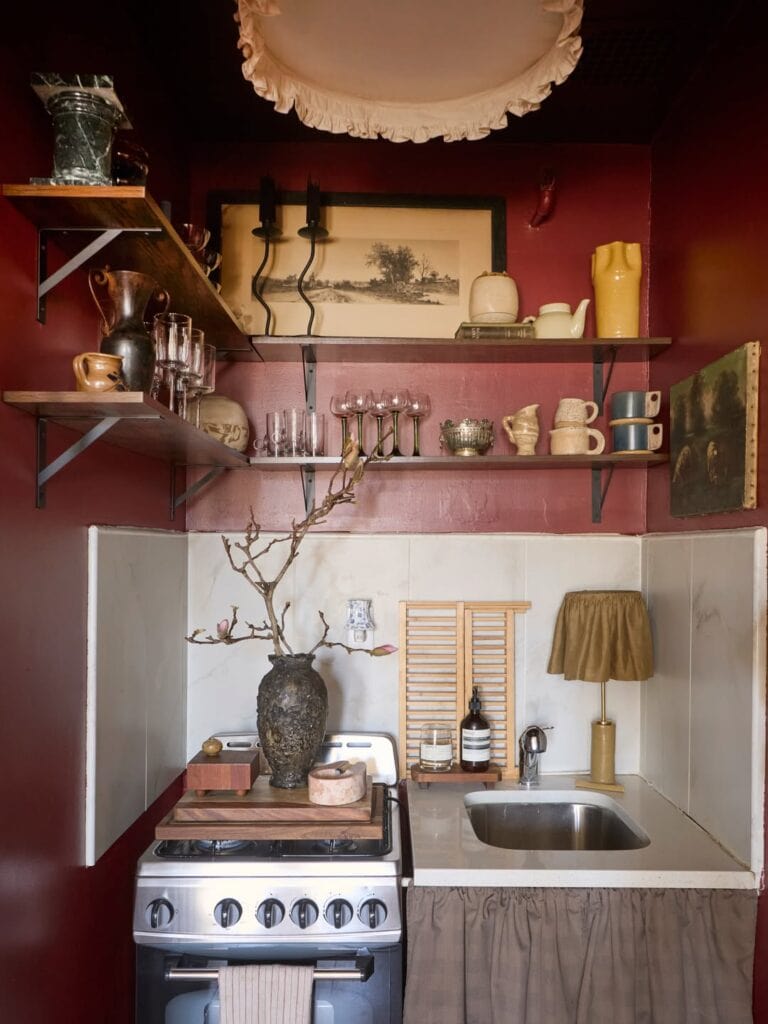
Saturated Wall Color to Make a Tiny Footprint Feel Cozy, Not Cramped
This micro kitchen features deep oxblood-red walls and a ceiling, along with open wood shelving that resembles a curated antiques display. In a small space, dark colors can create a sense of intention and warmth instead of making it feel cramped. This effect is enhanced by lighter elements like the marble-look backsplash and pale countertop. The fabric skirting under the sink and the ruffled ceiling fixture add a softness that prevents the moody colors from appearing harsh.
Takeaway: Don’t think a small kitchen has to be light and neutral. A bold, deep color can make a tiny space feel like a thoughtful design choice, as long as you balance it with some lighter surfaces.
Styling Suggestion: Use open shelving to showcase collected items, such as vintage glassware, ceramics, and artwork, instead of closed cabinets. In a small space, this approach turns storage into decor.
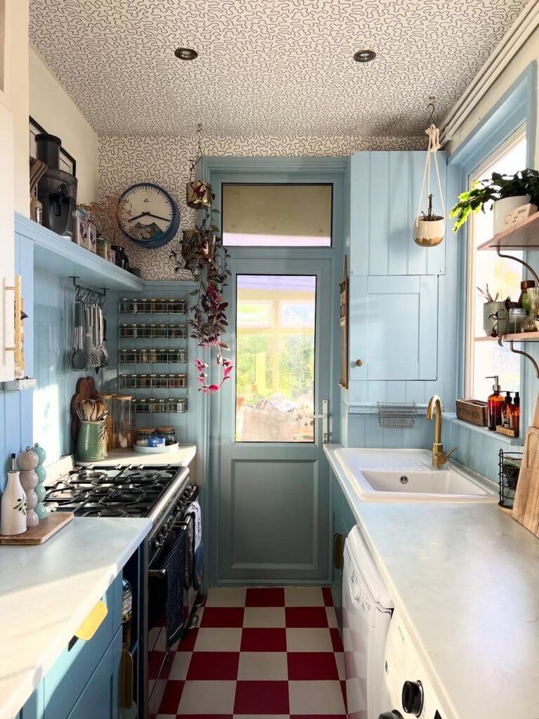
Pattern-Mixing Through Ceiling, Floor, and Hardware
A patterned wallpaper ceiling, checkerboard floor, and powder-blue cabinets create a cohesive look in this narrow galley kitchen. A magnetic spice rack and open utensil storage make the walls both functional and decorative. The design choice uses the ceiling as a fifth surface, a space many small kitchens leave bare. This approach adds visual interest without taking up any floor space. Brass faucet fixtures against the soft blue prevent the playful patterns from feeling overwhelming.
Takeaway: If your walls and cabinets are already one color, think about adding a pattern to the ceiling instead. This often-overlooked area in small kitchens can inject personality without cluttering the room.
Budget-Friendly Alternative: Using peel-and-stick wallpaper on the ceiling is a renter-friendly option to experiment with this style without making a long-term commitment.
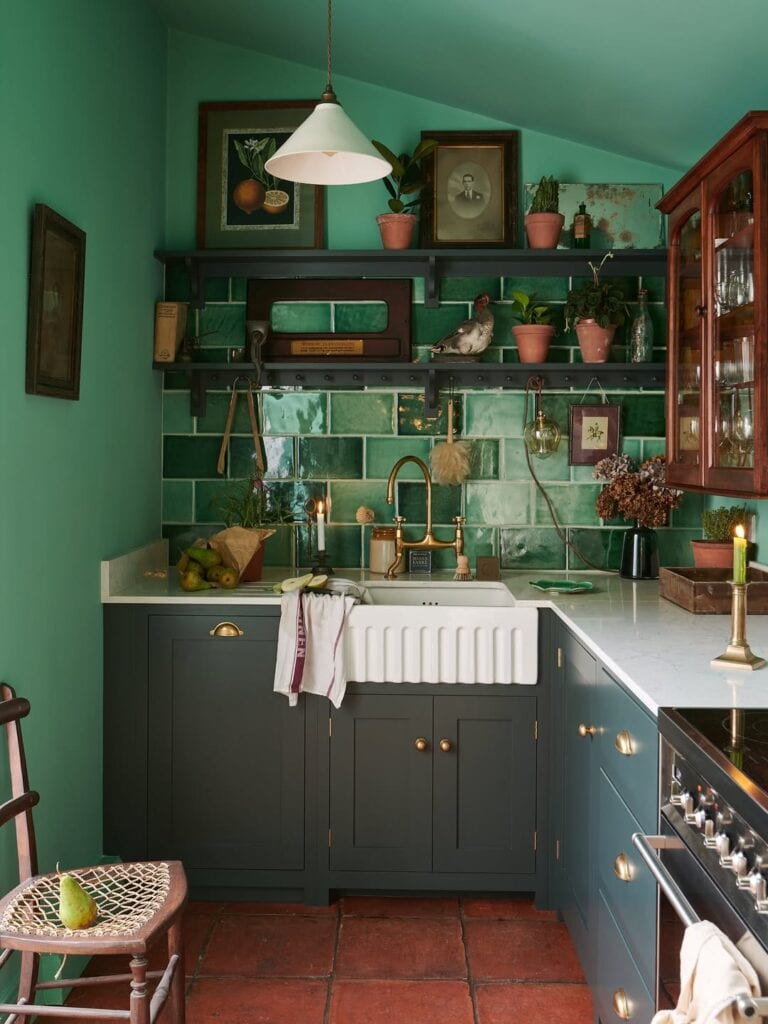
Jewel-Tone Tile as a Backsplash Focal Point
Glossy emerald subway tile climbs the wall behind a farmhouse sink. It pairs with matching dark green cabinetry and a terracotta tile floor. This design works because the backsplash protects the wall and acts as the room’s focal point. The glossy tile finish reflects light from the pendant fixture above. Brass hardware and a single antique cabinet with glass-front doors add warmth. This creates a collected, lived-in feel rather than a showroom look.
Takeaway: Choose one surface, usually the backsplash, to be your “statement” element. Let everything else, like cabinets, hardware, and the floor, support that choice without competing with it.
Why This Works: A glossy tile finish bounces light around a small room. Matte tile in the same color wouldn’t do this nearly as effectively.
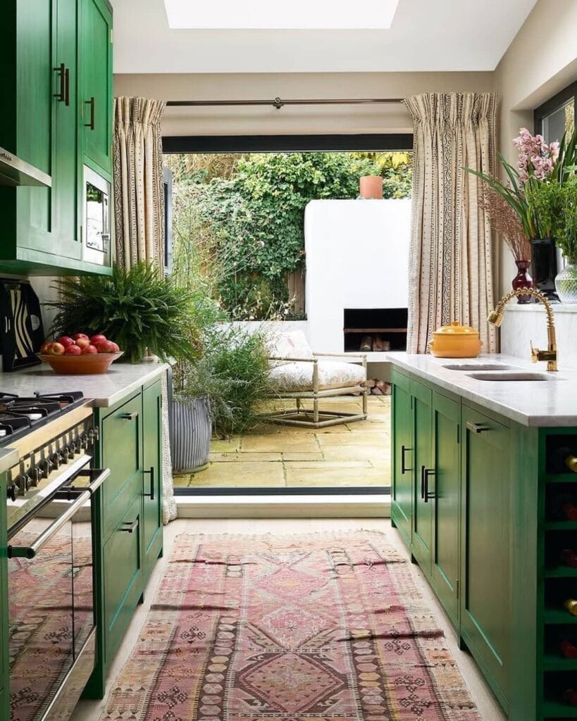
Letting an Indoor-Outdoor View Do the Visual Heavy Lifting
Deep green cabinetry frames a wide opening to an outdoor patio. Sheer curtains and a vintage runner soften the transition between the kitchen and garden. This technique involves borrowing scenery.
When a small kitchen has a view of greenery or outdoor space, treating that view as part of the room’s decor, rather than just a window, makes the interior feel bigger than its walls. The warm rug and brass fixtures prevent the saturated green from feeling cold.
Takeaway: If your kitchen has a window or door facing greenery, skip heavy window treatments that block the view. A sheer curtain or no treatment at all lets the outdoor view serve as extra square footage.
Best For: Ground-floor kitchens with a patio, balcony, or garden view just outside the window.
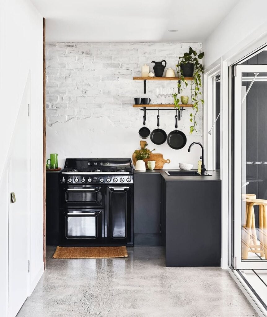
Monochrome Matte Cabinetry Against a Textured Wall
A matte charcoal cabinet runs beneath a whitewashed, exposed brick wall. Open wood shelving and a hanging rail keep the look from feeling too sterile or industrial. The combination of a rough, textured wall and flat-matte cabinetry creates depth through texture instead of color or pattern. This is a helpful approach when you want a small kitchen to feel calm rather than busy. A trailing plant and warm wood shelving soften the otherwise cool, monochrome palette.
Takeaway: If color and pattern aren’t your style, focus on texture instead. A textured wall (like brick, plaster, or limewash) paired with flat, matte cabinetry can add visual interest to a small kitchen without using any color at all.
Common Mistake to Avoid: Avoid pairing matte cabinetry with a matte wall and no other texture. This combination makes minimalist kitchens feel flat or cold instead of calm.
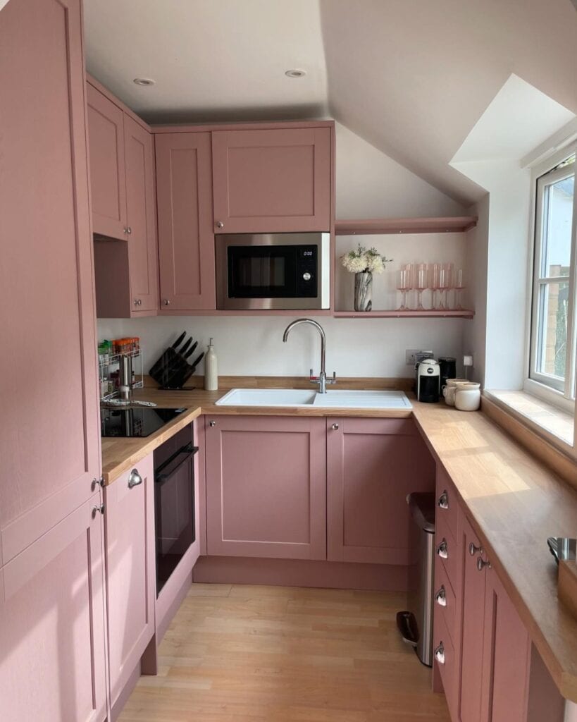
Soft Dusty Pink as a Warm Neutral
This kitchen with a sloped ceiling uses a soft dusty rose on every cabinet surface. It pairs well with warm butcher-block countertops and brushed-nickel hardware. The approach here treats a light color like it’s a neutral. The dusty pink feels calming instead of overly themed because of its low saturation. It complements the warm wood tones without clashing. Open shelving in the same pink shade, decorated with glassware and a single vase, keeps the color scheme flowing to the ceiling.
Takeaway: If you want to add color but worry it might look too trendy, opt for a muted, dusty shade instead of a bright one. It acts like a neutral and lasts longer.
Designer Tip: Match your open shelving to your cabinet color, not the wall, to create a continuous color story rather than a fragmented one.
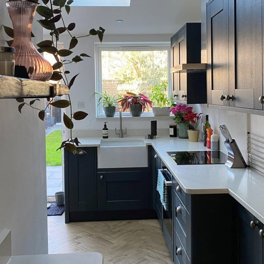
Indoor-Outdoor Flow Through a Garden-Facing Sink
A farmhouse sink is positioned right under a window that looks out onto a garden. Navy cabinets and a herringbone floor anchor the space. This follows the same “borrowed scenery” idea as the green kitchen mentioned earlier, but the sink’s placement allows you to enjoy the view at eye level while washing dishes. Fresh flowers on the counter reflect the greenery outside, creating a visual connection between the kitchen and the yard.
Takeaway: When deciding where to place your sink or main workstation, choose the spot with the best window view since you’ll spend the most time facing it.
Best For: Kitchens with a single garden-facing window and adaptable layout options.
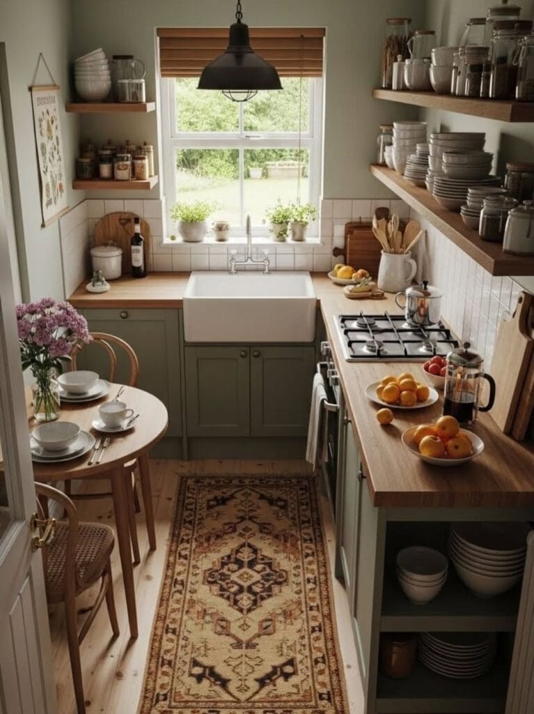
Layering a Rug to Make a Galley Kitchen Feel Like a Room
A patterned vintage-style runner anchors this narrow sage-green galley kitchen. It pairs well with open wood shelving filled with everyday dishware and a small round dining table tucked into the end of the room.
The rug plays an important role here; it visually breaks up the long wood floor, adds warmth underfoot, and signals that “this is a finished room,” not just a utilitarian hallway between cabinets. Displaying stacked plates and bowls on open shelves instead of hiding them in cabinets adds texture and makes storage feel intentional.
Takeaway: A runner rug is one of the most affordable ways to make a narrow kitchen feel styled instead of just functional. Choose one with warm tones to soften hard floors and cabinetry.
Pro Tip: Open shelving works best when your dishware is mostly uniform in color. A stack of mismatched mugs looks cluttered, while a stack of matching white or cream mugs appears curated.
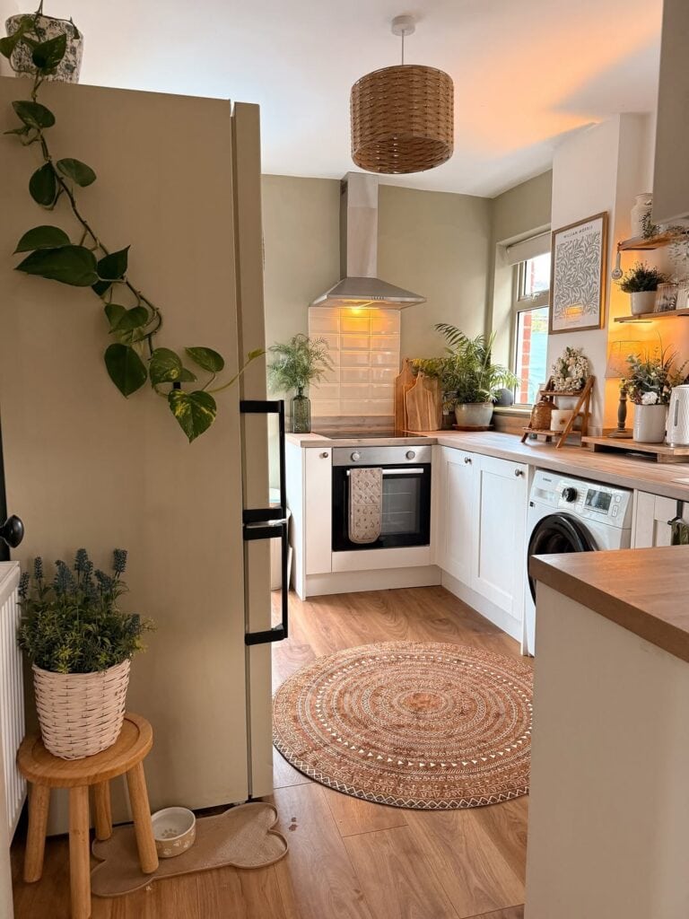
Trailing Plants to Soften Hard Lines
In this warm, sage-toned kitchen, a trailing pothos drapes down the side of a tall fridge cabinet. More potted plants line the windowsill and shelves. This design uses plants for their shape. A trailing vine smooths the hard vertical edge of a cabinet or appliance in a way that an upright plant cannot. The warm light from a woven pendant and layered rugs on the floor create a cozy atmosphere that plain cabinetry color alone would not provide.
Takeaway: Place one trailing plant, like pothos or ivy, in a spot with a hard vertical edge, the top of a fridge, a shelf edge, or a cabinet corner, to instantly soften the room’s geometry.
Budget-Friendly Alternative: Faux trailing greenery can achieve the same visual softness if you are unsure about keeping a living plant in a low-light kitchen.
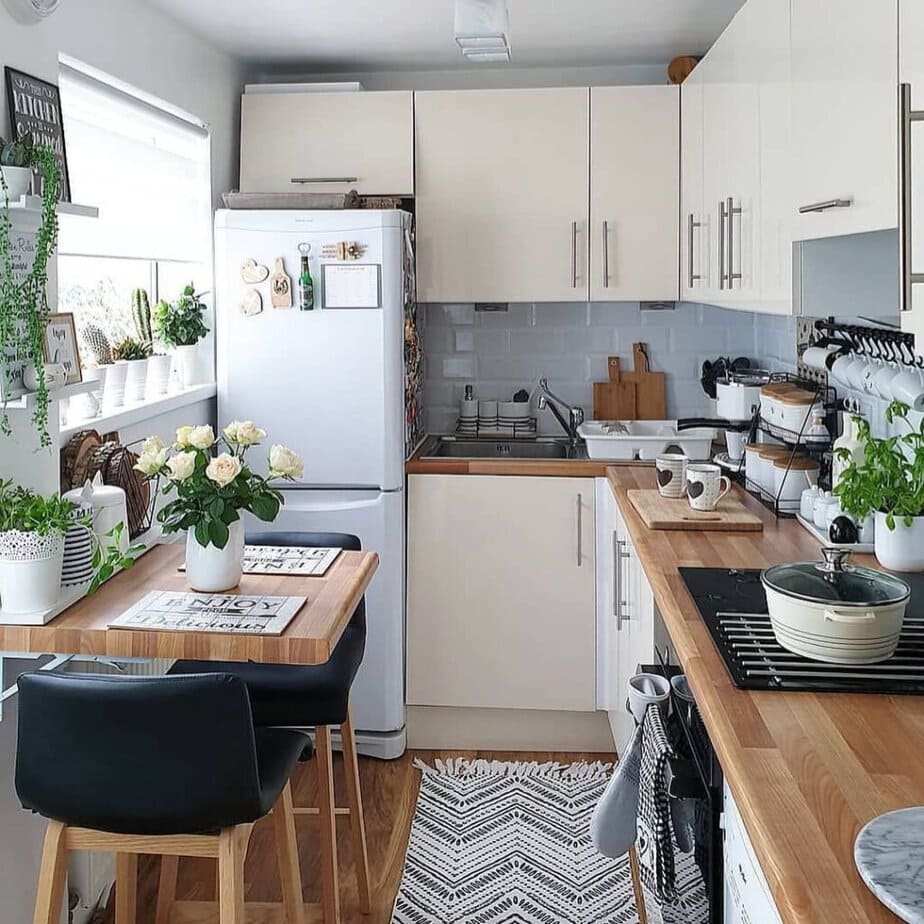
Open Wire Shelving to Display Mugs and Dishware as Decor
This bright white kitchen features a hanging wire rack displaying mugs alongside a collection of wooden cutting boards. A small two-seat dining table is tucked against the fridge to make the most of the limited space. The technique turns everyday items into a styled vignette: mismatched mugs create a charming display when hung evenly on hooks rather than cluttering a cabinet shelf. Fresh flowers on the table and trailing plants on the windowsill add the same softness found in other areas, showing that this approach works across various color schemes.
Takeaway: If you’re limited on cabinet space, a wall-mounted mug rack or hook rail provides storage while also serving as a decorative detail.
Common Mistake to Avoid: Overcrowding open shelving or hooks with too many items. The “styled” look needs some empty space between objects, rather than being completely full.
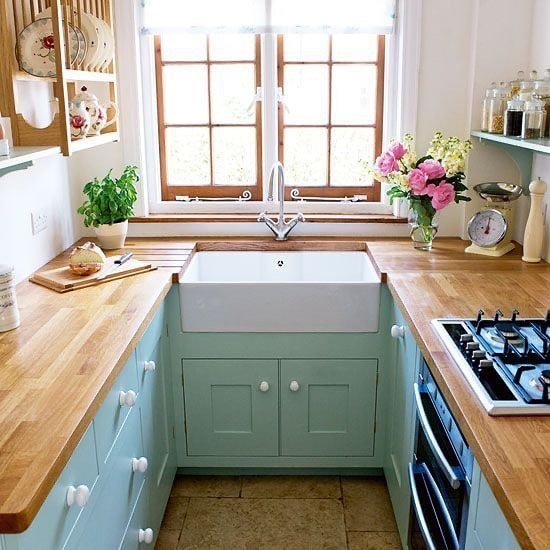
A Farmhouse Sink as the Cottage-Style Anchor
A deep white farmhouse sink is the focal point in this small U-shaped kitchen. It is surrounded by butter-yellow cabinetry, wood countertops, and a wall-mounted plate rack above. The design focuses on one standout piece. The chunky, apron-front shape of the farmhouse sink draws the eye, while the matching wood countertops on both sides create a continuous flow. Fresh flowers and a vintage scale on the counter enhance the cottage vibe without creating visual clutter.
Takeaway: A single statement piece, whether a farmhouse sink, a colorful range, or a bold faucet, can define the style of a small kitchen. It’s wise to invest there while keeping other choices simple.
Styling Suggestion: Opt for a wall-mounted plate rack instead of closed cabinets for everyday dishware. It adds charm and keeps frequently used items easily accessible.
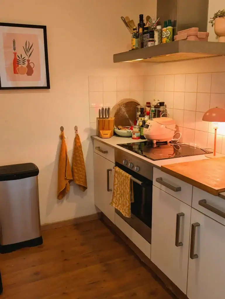
A Warm Accent Lamp to Add Ambient (Not Just Task) Lighting
This small kitchen uses a single warm-toned table lamp next to the stove. It adds a softer, golden glow to the harsh overhead light from the range hood. This method layers light sources like you would in a living room. Many small kitchens depend only on bright overhead or task lighting. By adding one warm lamp, you create ambient light that makes the space feel cozy rather than clinical, especially in the evening. Mustard tea towels and a framed print echo the warm tones of the lamp, connecting the lighting choice to the overall color scheme.
Takeaway: Add a plug-in lamp to your counter or open shelf. It’s a simple way to bring warmer, layered light into a kitchen that mainly features overhead lighting.
Why This Works: Warm ambient light, compared to cool white overhead light, makes a small space feel more inviting and less like a utility area.
Conclusion
Small kitchen decor boils down to making fewer, better choices. One bold color, one standout fixture, and one consistent material theme will always work better than several timid, unfinished ideas battling for attention in a small space. Constraints are not barriers to good design; in a small kitchen, they provide the focus that quality design needs.
If you’re unsure where to begin, choose the one element in your kitchen that you use the most: your sink, your stove, or your main wall of cabinets. Consider what a more intentional version of that element would look like. Start there, then add lighting and plants once that focal point is established, and let the rest of the room complement it.
Your square footage was never the main issue. When you start to view your small kitchen as a space worth decorating, not just a place to get by, you will be surprised by how much larger it feels.