Fall Color Palette: A Complete Guide to Warm and Inviting Seasonal Decor
A well-curated fall color palette can instantly transform your space, making it feel warm, inviting, and perfectly in tune with autumn’s natural beauty.
Whether you’re planning a full seasonal makeover or simply want to incorporate a few accents, understanding how to work with fall colors is the first step in creating a home that reflects the charm of the season. Think deep rusts, golden ambers, earthy greens, and soft neutrals that echo falling leaves, harvest gatherings, and cozy evenings by the fire.
In this guide, you’ll discover the most popular fall color combinations, learn tips for incorporating them into your existing decor, and explore ideas for adapting palettes to match your unique style. Whether your taste leans modern, rustic, boho, or traditional, this article will help you confidently choose and apply a fall color palette that feels both timeless and fresh.
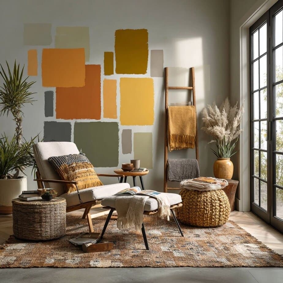
Popular Fall Color Combinations
Choosing the right color palette can completely shift the mood of a room. Whether you want something classic and cozy or modern and moody, these popular fall color combinations provide the perfect starting point. Each pairing is versatile, seasonally appropriate, and easy to adapt to your style.
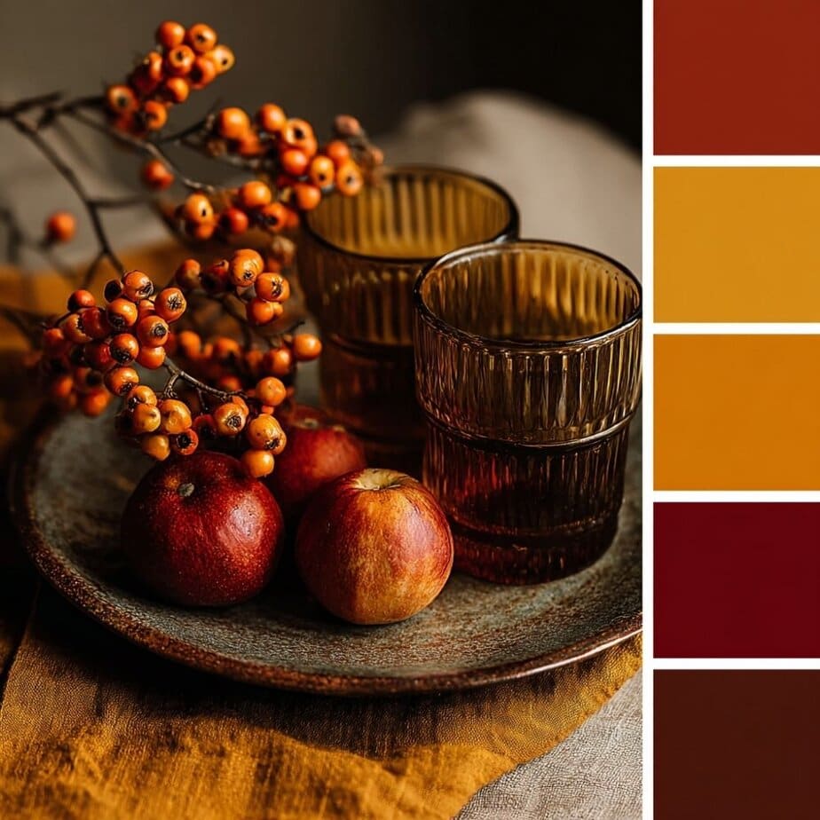
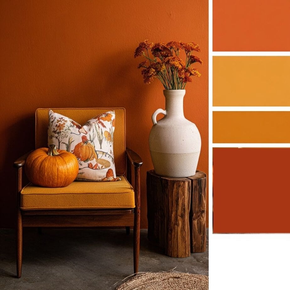
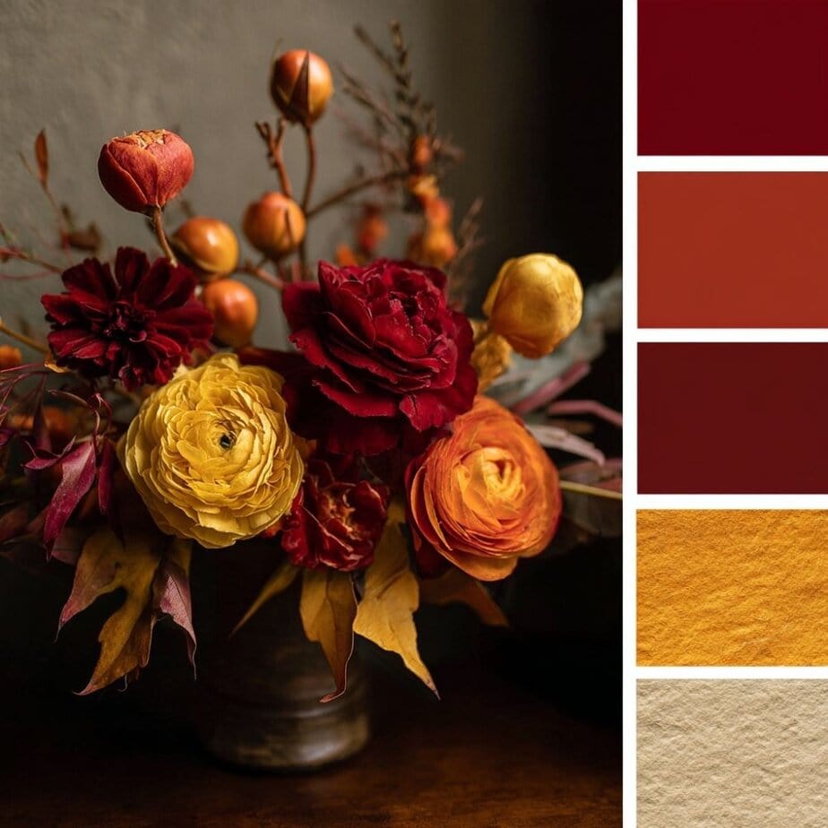
1. Classic Autumn Palette
Colors: Burnt orange, deep red, golden yellow, rust
Vibe: Traditional, cozy, vibrant
This palette captures the heart of fall foliage. It’s perfect for anyone who loves the nostalgic feeling of pumpkin patches, hayrides, and harvest dinners.
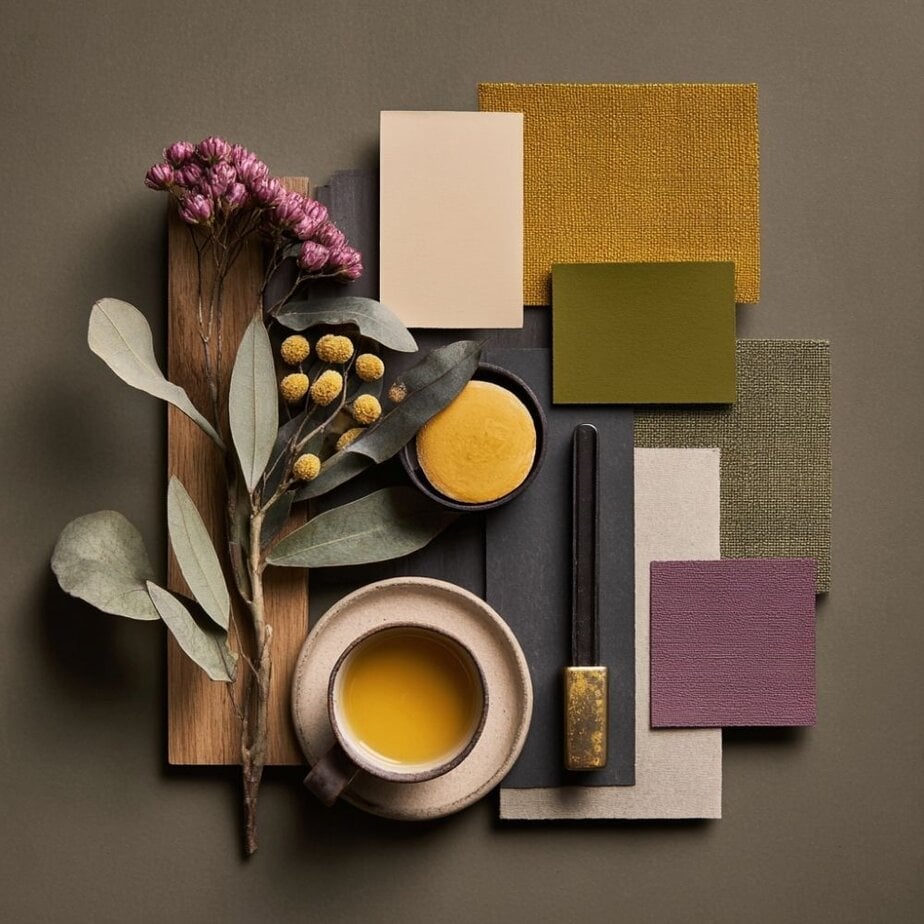
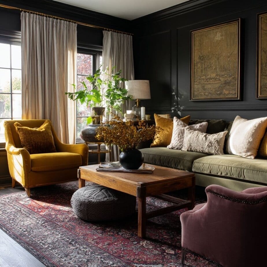
2. Muted & Moody Palette
Colors: Olive green, mustard, charcoal, mauve
Vibe: Sophisticated, calm, earthy
For a more refined and modern take on fall, this palette blends muted hues with deeper, dramatic tones. Ideal for moody bedrooms, reading nooks, or modern living rooms.

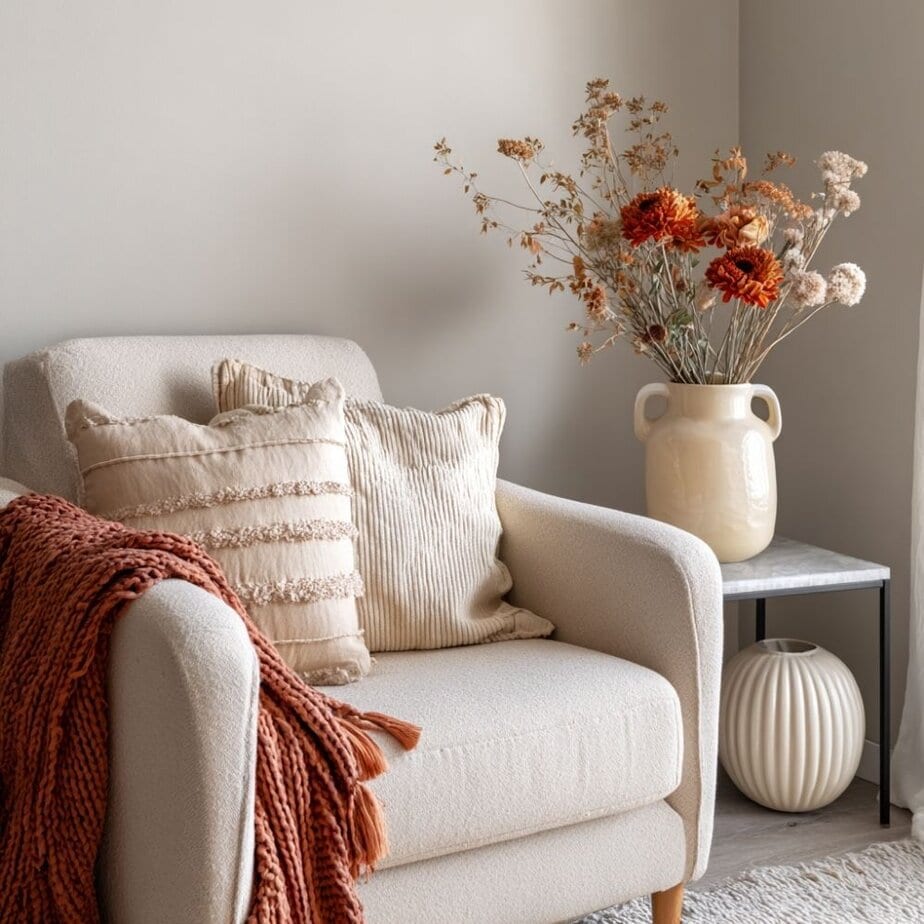
3. Neutral & Natural Palette
Colors: Beige, warm white, soft grey, camel brown
Vibe: Minimalist, serene, airy
This palette is all about quiet elegance. If you prefer a clean, Scandinavian or Japandi-inspired look, these soft, nature-inspired neutrals work beautifully.
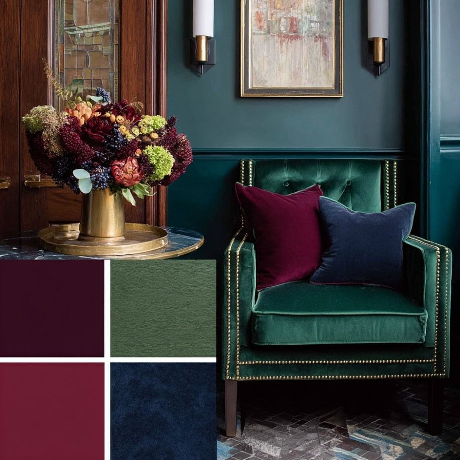
4. Jewel-Toned Palette
Colors: Emerald green, navy, plum, burgundy
Vibe: Luxe, rich, dramatic
Perfect for adding elegance and a touch of glam to your fall decor. This palette pairs especially well with antique gold or brass accents.
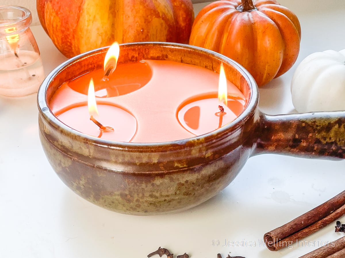
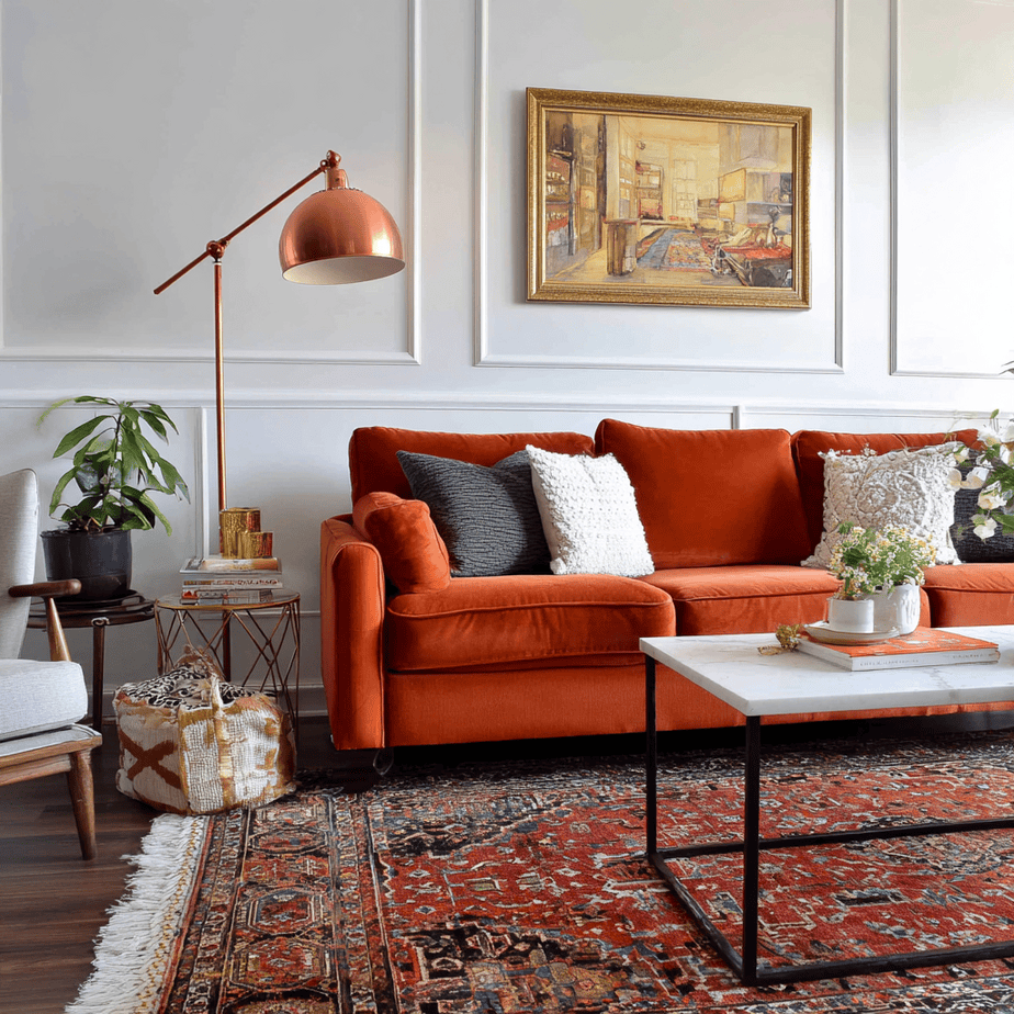
5. Pumpkin Spice Palette
Colors: Pumpkin, caramel, cinnamon, nutmeg
Vibe: Warm, cozy, inviting
Inspired by fall baking and candle scents, this palette is ideal for kitchens, dining spaces, and cozy living areas. It’s the essence of “comfort meets charm.”
How to Choose the Right Fall Palette for Your Space
With so many beautiful fall color combinations to choose from, how do you know which one is right for your home? It’s not just about picking your favorite shades; it’s about finding a palette that works with your space, reflects your style, and enhances the overall mood you want to create.
Here are a few tips to guide you:
1. Start with Your Existing Decor
Look at your furniture, flooring, and wall colors. What undertones are already present? A warm-toned couch or wooden flooring might work better with earthy or burnt hues, while cooler-toned spaces can be softened with neutrals and deep jewel tones.
2. Consider the Natural Lighting
Rooms with lots of natural light can handle deeper, moodier shades without feeling heavy. On the other hand, if your space is dim or north-facing, opt for lighter neutrals and warm tones to keep things cozy and bright.
3. Define the Mood You Want
Do you want your space to feel energized, relaxed, elegant, or cozy?
- Cozy: Try terracotta, mustard, and rust.
- Calm and clean: Use soft beige, oatmeal, and dusty sage.
- Luxe and dramatic: Go for navy, plum, and gold.
- Rustic and homey: Stick with earthy browns, pumpkin, and olive green.
4. Use the 60-30-10 Rule
A simple guideline for balancing your palette:
- 60% dominant color [walls or large furniture]
- 30% secondary color [rugs, curtains, bedding]
- 10% accent color [pillows, vases, candles]
5. Draw Inspiration from Nature
When in doubt, step outside. Autumn forests, golden fields, sunsets, and seasonal produce offer incredible color cues. Snap a few photos or collect leaves and dried flowers to see how colors work together in real life.

Where to Use Fall Colors in Home Decor
Once you’ve chosen your fall color palette, the next step is knowing where to use it. You don’t need to redecorate your entire home; small, intentional updates can make a big impact. Here’s how to bring fall colors into different areas of your home, room by room.
1. Living Room
This is often the heart of the home and the easiest place to add seasonal color.
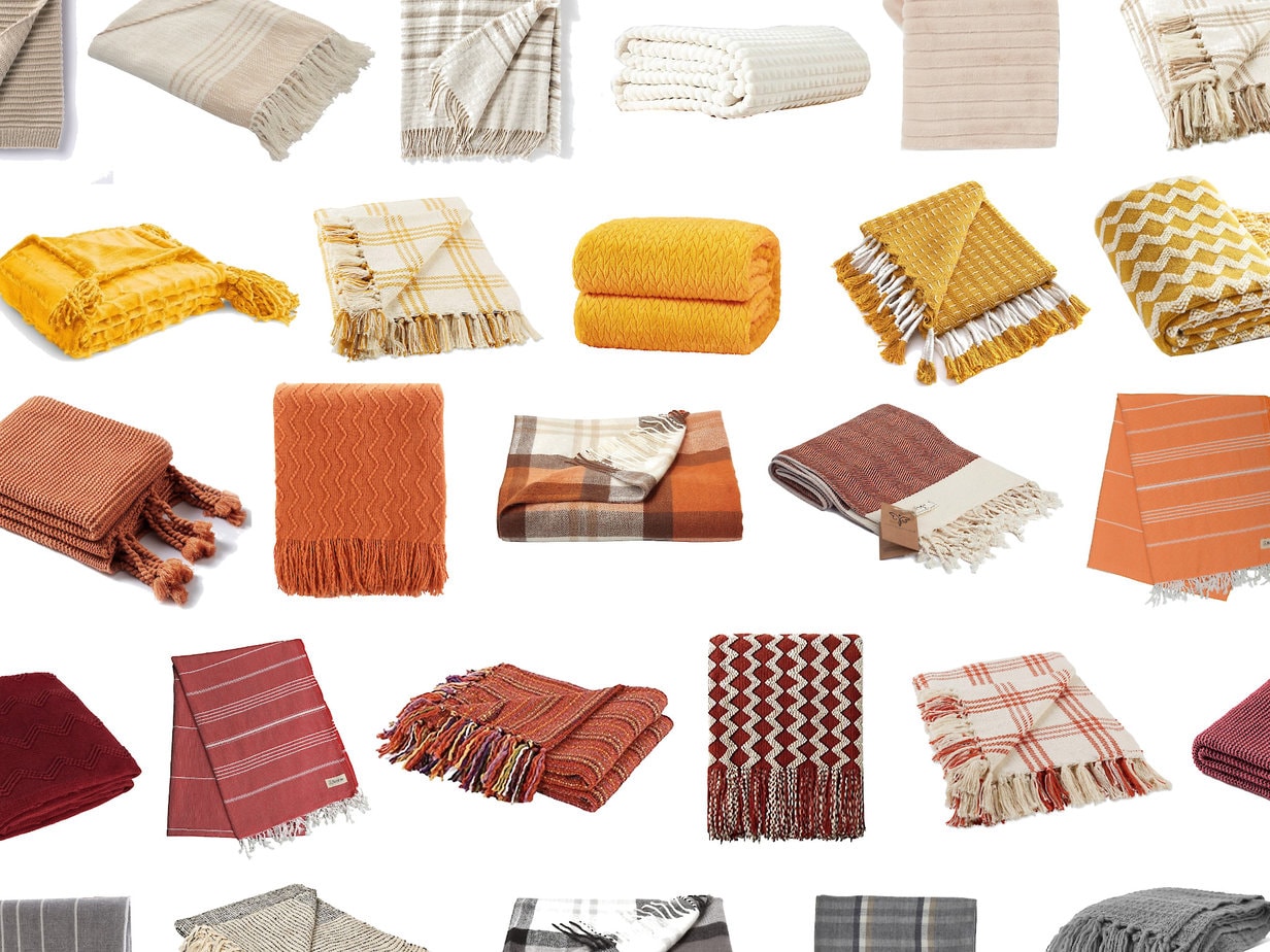
- Swap out throw pillows and blankets in rich fall tones.
- Add a textured area rug in warm hues like rust or mustard.
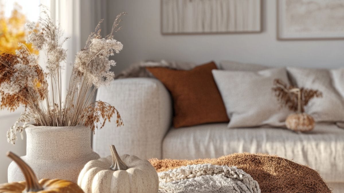
- Decorate with seasonal florals, pampas grass, or eucalyptus in vases.
- Introduce artwork or wall prints with fall-inspired color schemes.
2. Dining Room
Set the stage for cozy dinners and holiday gatherings.
- Use table runners, placemats, and napkins in earthy tones.
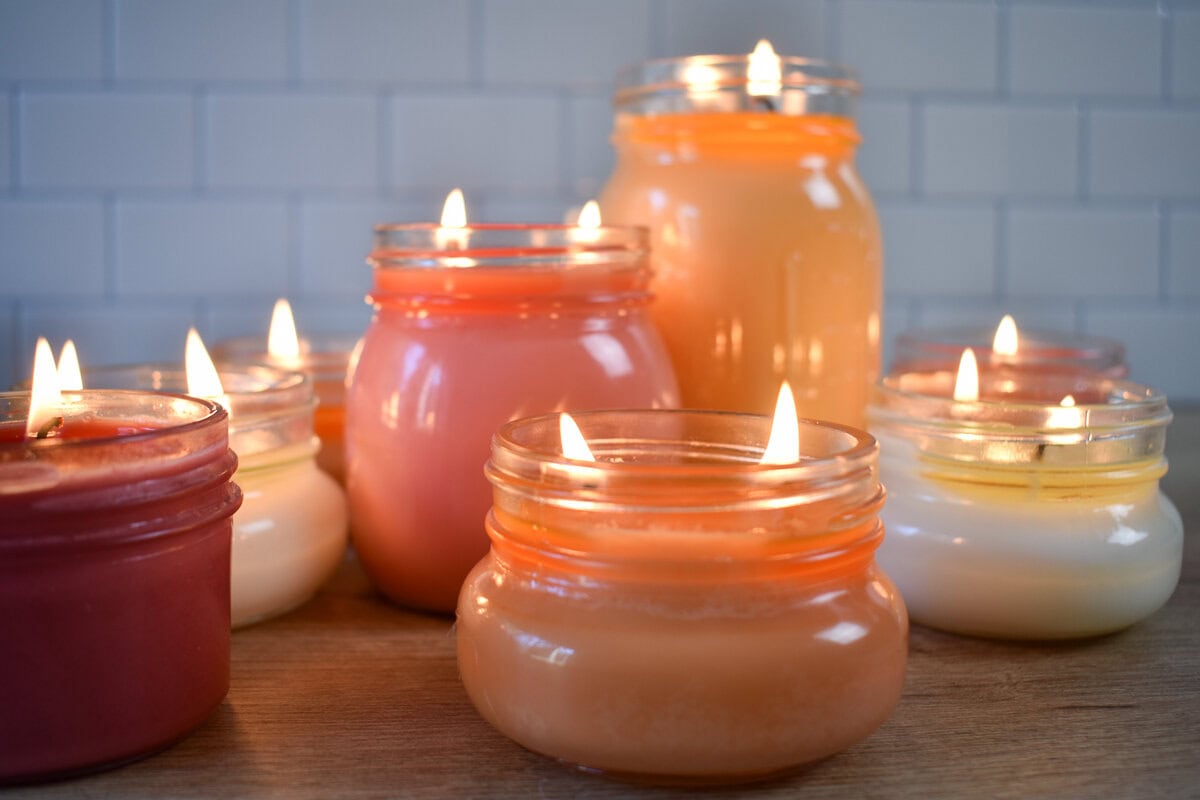
- Layer your centerpiece with dried flowers, pumpkins, or candles in copper or brass holders.
- Incorporate wood, ceramic, or stone tableware to match your color palette.
3. Kitchen
Add warmth and character without a full renovation.
- Display seasonal fruits like apples or pears in a wooden bowl.
- Switch out dish towels, oven mitts, and utensil holders in fall shades.
- Add amber glass jars or copper accents for a functional and decorative touch.
4. Bedroom
Create a restful, cozy retreat as the temperatures drop.
- Layer your bed with warm-toned quilts, flannel sheets, or velvet throw blankets.
- Add bedside lamps or candles in warm metallic finishes.
- Hang a seasonal wreath or artwork above the headboard.
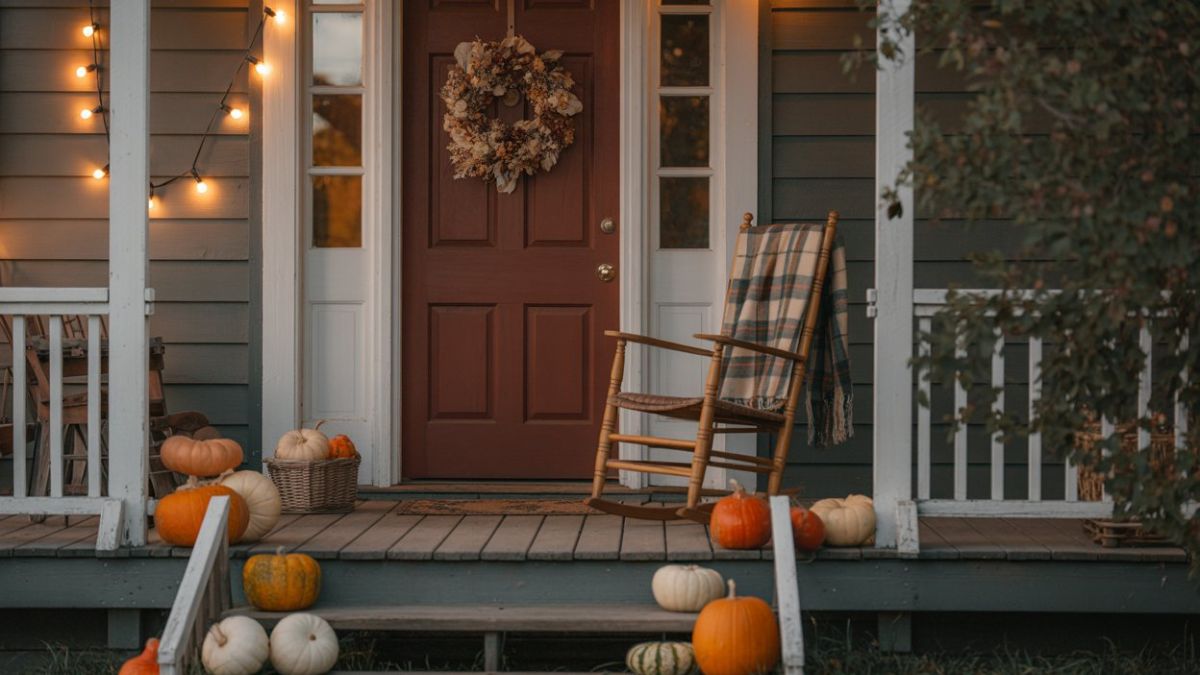
5. Porch or Entryway
Make a seasonal first impression.
- Use fall-colored mums, pumpkins, or planters in terracotta pots.
- Layer a patterned doormat over a neutral base rug.
- Add a fall wreath to your door and switch out porch pillows or lanterns for ones in your palette.
Tips for Layering Fall Colors Without Overwhelming Your Space
Adding fall colors to your home should feel intentional and balanced, not busy or chaotic. The key is knowing how to layer colors with purpose so your decor feels cozy, not cluttered. Here are some tried-and-true tips for creating harmony with your fall palette.
1. Use Neutrals as a Base
Start with soft neutrals like cream, taupe, beige, or light gray. These tones help anchor the space and allow bolder fall colors to pop without competing for attention.
2. Introduce Color Through Textiles
Textiles are one of the easiest and most flexible ways to layer color:
- Swap in throw blankets, cushions, curtains, or table linens in seasonal shades.
- Look for cozy materials like wool, velvet, linen, or knit for extra texture and warmth.
3. Stick to a Balanced Palette
Choose no more than 3 to 4 key colors: one dominant, two complementary, and one accent. This keeps the space visually cohesive and prevents it from feeling overdone.
4. Mix in Natural Elements
Incorporate natural materials like wood, wicker, rattan, stone, or dried botanicals to add texture and support your palette without adding more color.
5. Add Color in Layers, Not All at Once
Build your palette gradually. Start with larger items like rugs or curtains, then layer in medium items like table runners and art, and finally finish with smaller accents like vases, candles, or florals.
6. Repeat Colors Across the Room
Echo similar tones in different areas to tie the room together. For example, if you use rust in a pillow, add a rust-toned vase or wall art nearby.
7. Let Seasonal Decor Be Temporary
Use easily swappable items for your fall colors so you can transition your home again when winter or spring arrives without a complete overhaul.
Fall Color Palettes for Different Decorating Styles
No matter your decorating style, there’s a fall color palette that can enhance your aesthetic while still embracing the warmth of the season. Here’s how to tailor your fall color choices to match your unique interior vibe.
1. Modern Farmhouse
Palette: Rust, ivory, olive green, matte black
Style Notes:
- Stick to clean lines and a neutral base with warm accent colors.
- Use black hardware or fixtures for contrast.
- Add rustic textures like reclaimed wood, linen, and galvanized metal.
2. Boho
Palette: Mustard yellow, plum, terracotta, blush
Style Notes:
- Mix rich hues with layered textures and natural fibers.
- Incorporate macrame, woven baskets, and patterned textiles.
- Go bold with eclectic wall art and thrifted finds.
3. Traditional
Palette: Burgundy, forest green, gold, burnt orange
Style Notes:
- Embrace classic fall tones in rich fabrics like velvet or jacquard.
- Add brass candlesticks, dark wood furniture, and timeless patterns like plaid or toile.
- Decorate with harvest-inspired centerpieces and floral arrangements.
4. Minimalist
Palette: Taupe, wheat, clay, off-white
Style Notes:
- Stick to a limited color palette with clean, uncluttered lines.
- Focus on natural light, soft textures, and subtle seasonal accents.
- Add interest through shape and form rather than bright color.
5. Eclectic
Palette: Burnt orange, emerald, navy, copper
Style Notes:
- Mix and match unexpected color pairings.
- Layer different textures, prints, and vintage pieces.
- Let your personality shine through curated objects and bold color pops.
Each of these palettes can be adjusted based on how bold or subtle you want your fall decor to feel. The key is to stay consistent with your style while using seasonal hues to enhance your space, not redefine it.
FAQs: Fall Color Palette
1. Can I mix fall colors with my current home decor?
Yes! The key is balance. Start with a neutral base and layer in seasonal colors through accents like pillows, throws, and florals. Stick to 2 to 3 fall colors that complement your existing scheme for a cohesive look.
2. What’s the best fall palette for a small space?
In smaller rooms, opt for lighter neutrals like warm beige, soft clay, and creamy white, then add one bold accent like burnt orange or olive green. This keeps the space feeling open while still giving it a fall vibe.
3. How can I decorate for fall on a budget?
Use what you have first. Rearrange existing decor, repurpose neutral items, and bring in natural elements like pinecones, branches, or dried florals. Affordable additions like pillow covers, candles, and DIY wreaths in seasonal hues can make a big impact without overspending.
4. What’s the difference between a fall and winter color palette?
Fall palettes lean warmer and earthier; think rust, gold, terracotta, and olive. Winter palettes shift cooler and deeper with shades like deep green, icy blue, plum, and snowy whites. Metallics also tend to go from warm copper to frosty silver.
5. Are there trendy fall colors this year?
Each year brings subtle shifts. This season, expect to see:
- Dusty rose and burnt sienna for a soft, feminine twist
- Olive and sage green for a grounded, nature-inspired look
- Muted mauve and charcoal for moody, modern palettes
- Brushed gold and copper for a cozy yet elevated finish
Conclusion: Bring Fall to Life with Color
Creating a fall color palette is about more than just decorating; it’s about setting the tone for the coziest, most inviting season of the year. Whether you lean toward classic autumn hues or prefer a more muted, modern vibe, the right palette can instantly transform your space into a seasonal sanctuary.
By understanding how colors interact, choosing tones that suit your style, and thoughtfully layering them throughout your home, you can achieve a look that feels warm, intentional, and uniquely yours. From bold jewel tones to earthy neutrals, fall offers endless inspiration for every taste and home.
So go ahead, gather your swatches, cozy textures, and seasonal accessories. Let your chosen fall palette guide the way as you create a home that feels as beautiful and comforting as the season itself.